Sunday 30 October 2011
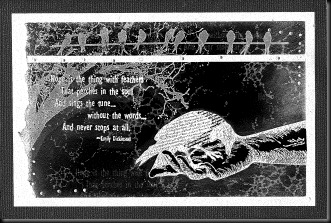
Hope is the thing that perches in the soul – black and grey
26 very kind comments from lovely people at Sunday, October 30, 2011When it comes to Hallowe’en, I’m afraid I’m a conscientious objector ;)
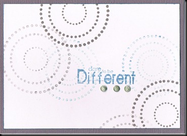
But I really fancied some grey and black stamping, which just happens to be one of the themes at Gingersnap this month, so here’s my offering in four different formats.
I always scan through Photoshop and have never tried the various scanner settings before because at first I didn’t have time and then I simply didn’t even notice them! So today, I played a little and scanned with all three settings: –
Autumn is now in full swing and it’s almost dark already (4.40pm) – the days will draw in now and we’ll have less and less light until the effect begins to reverse on 21 December. I really miss the natural light and hate going to work in the dark but hey ho - this is the beauty of England! Time to stay warm and get some crafting time in, when time allows, methinks!
Labels: black and white
Saturday 29 October 2011
We are all stars . . . Less is More
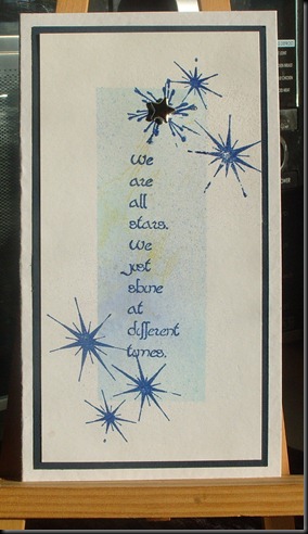
36 very kind comments from lovely people at Saturday, October 29, 2011LESS is MORE this week has the theme of Stars.
I knew I had the perfect words (Stamp Camp, I think) but couldn’t work out how to use them, so I masked off an area of white card and sprayed it with subtle colours of Glimmer Mist – Sea Grass and Peony (I think), then blotted it with my paper towel roll, which just happened to have some ochre ink on from a previous project (messy). I liked it.
I stamped the lovely blotchy stars but – despite NOT being a glitter lover - wanted a bit of glitter, so I embossed with Holographic EP and added a silver star brad.

Stamping was done with Versafine Blue – can’t remember the exact name but it’s a lovely royal blue.
Labels: Creative Masking, LESS IS MORE, Quick and Easy
Sunday 23 October 2011
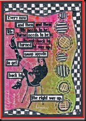
I’ve just had a lovely couple of hours of fun, playing with this and would like to enter it into the following challenges:-
Crazy Amigo (Numbers – lots of those)
Three Muses (Circles and Squares – well, if you can call rectangles squares, he, he)
Take a Word (Childhood)
Sunday Stamper Autumn colours.
Art Journey Challenge (Text)
Labels: JOURNALLING, STAMPED INKY BACKGROUNDS
Wednesday 19 October 2011
Pretty colours – Summer just a memory…
26 very kind comments from lovely people at Wednesday, October 19, 2011Summer already seems like a long time ago. It’s freezing this morning and the weather has suddenly become very autumnal. We’ve had heavy rain, sleet and winds here in the North West and it’s really chilly.
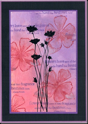
These are Dusty Concord and Fired Brick Distress inks on glossy (encaustic type) card and I think it looks really rich. I think I pulled the colour in with a damp paintbrush again … can’t remember! Definitely a CRAFT moment! (Can’t Remember A Flipping Thing). It’s a very simple card and was really quick to make.
I thought this was an unusual colour combo until I remembered using similar Adirondack colours (Eggplant and Watermelon) together – virtually the same shades. Must admit I’d never thought of using them together until one of my friends, Ann, used them in a workshop and I fell in love with the combination! Thanks, Ann.
Wrap up and stay warm, everyone. I’ll certainly be doing that on my way to class today!
Labels: INKY BACKGROUNDS, Quick and Easy
Tuesday 18 October 2011
Just a little note to say thank you to the guys over at Gingersnap for choosing me as a Ginger Gem! Woohoo! What an honour and very much appreciated. That was a lovely way to brighten a thoroughly miserable day in NW England.
I’m busy for the next few days but I’ll try to visit the other Gingers as soon as I can.
Update - I was chosen again - woohoo! Didn't want to post again, so thought I'd just say thank you here to the Gingers. Very much appreciated :-)
Labels: Award
Monday 17 October 2011
Finally finished my swap for KCUK – late as ever – naughty :-(
It’s an Adirondack day, today :-)
I stamped and embossed the two Dylusions ivy stamps, watercoloured them, stamped the verse (Stampcamp) then painted with Versamark reinker and clear embossed. (Don’t know why I bothered cos I laminated it anyway, lol.)
I wanted this to be sunny, so I then added Pool and Sunshine Yellow inks to a craft mat, spritzed with water and picked up the colour with the bookmark. Finished it off by inking the edges with Stream ink.
The back was slightly inky, so I just sponged more inks (same colours) all over it and stamped it with various leaves in Lettuce and Meadow, adding some random leafy words (PSX). The whole thing is edged in Krylon Gold pen, then laminated. I’ll add some ribbons and fibres to it before posting it.

Course, I couldn’t waste the inks on the mat, so I added a little more, spritzed again and mopped up with another card, with which I made a matching card, using one of the ivy stamps and the leafy words. Very simple but I like it. I tilted the card to encourage the inks to run for a different effect and after stamping the ivy, pulled the colour in from the edges (Lettuce) with a damp paintbrush.
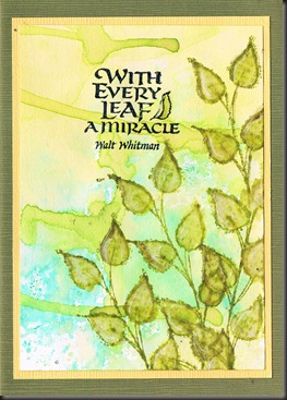
This fits Hels’ Sunday Stamper challenge for this week – Leaves and also loosely fits the Rainbow Lady’s Challenge – Falling Leaves, so I’m entering them for both.
New Doc gave me some tablets this morning and I feel a bit spaced out after taking them – feel almost tipsy, lol. NOT good when I have 3 days’ lesson planning to do this afternoon, hey ho! Off to work we go…. x
Labels: INKY BACKGROUNDS, KCUK
Sunday 16 October 2011
I had to make a quick card for my niece and decided to use this image for a simple card on glossy.I’d used Dylusions spray inks – hot pink and rusty orange, or whatever they’re called and quite liked the effects, so I started playing with another piece, using the same image and this is how it ended up. This one’s going to be a book cover, unless I stick it in my journal!
I stamped the words directly on the glossy paper but didn’t like them because they were hard to read and too close together, so I stamped again on white card, embossed, and cut out to rearrange over the top, using the first lot of stamping as part of the design.
Labels: JOURNALLING, STAMPED INKY BACKGROUNDS
Friday 14 October 2011
GINGERSNAP: SHARED MOMENTS, COLOUR CHALLENGE AND KCUK SWAP…
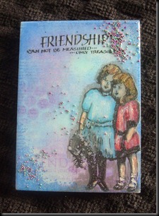
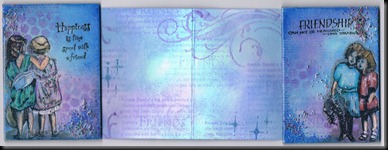
27 very kind comments from lovely people at Friday, October 14, 2011I’m just sneaking in by the skin of my teeth for the Gingersnap Random Redhead challenge, which is ‘Shared Moments’ but I didn’t realise when making it that this would also fit the Colour Challenge, which is Blue, Turquoise and Purple, so I’m entering it for both challenges.
This is also my Stampbord swap for KCUK and yes, it’s late – as usual (hangs head in shame). In my defence, I’ve had a few really busy weeks with work and other stuff but that doesn’t really excuse me. Fortunately, the recipient of my swap doesn’t blog, so won’t see this and I can upload it.
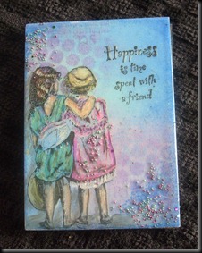
I made a little ATC sized book, using Stampbord ATCs for the covers, with the theme of Friendship. I have to confess that I cried while making it, but that’s another story and this isn’t the place to share it… lots of memories, some happy. some sad. I used to make a lot of mini books, especially when I was running workshops but it’s been a while and I really enjoyed this for a change.
I used my favourite medium – pigment inks – because they blend so beautifully, even with fingers, and always look really vibrant – added to which, they’re PERMANENT, so won’t fade, unlike ALL water based inks. The covers are embossed with 3 layers of clear embossing powder, then the corners sprinkled with Suze’s Bedazzles. Looks as if I've covered part of the wording on the cover, but it's still readable in real life.
I’ve noticed that my scanner doesn’t seem to be picking up the nuances in shades, which has really been frustrating me, so I’m going to show you the scans first, followed by a photo, so you can see the difference in them. The real thing is probably a little between the two for the covers, because the sun shone for a few moments (it really did, even in North West England!!) and the light reflected off the glossy finish of the EP. I used Prisma pencils to colour the images and, unfortunately, semi obliterated the faces of the little girls on the front cover, but the overall effect is OK, so I’m happy with it.
Labels: KCUK, Projects, Stampbord, STAMPED INKY BACKGROUNDS
Sunday 9 October 2011
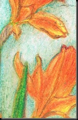
When I remembered that Hels’ challenge for this week (Sunday Stampers) was blue and orange, I knew I’d just used those colours on my daffs/narcissi but I wanted to play for a little while, so I stamped a journal page.
Believe it or not, this is nothing but blue and orange – Stormy Sky, Spiced Marmalade, Tumbled Glass, a little bit of Rusty Orange (Dylusions) and some Walnut Stain around the edges. It’s busy and a bit overdone but it was fun :-) I coloured the images (Dylusions) with Copics/Promarkers. Just decided she needs another hand, he, he – one to hold the brolly. Will put that right ASAP…
Labels: JOURNALLING
Okay, I KNOW it’s not Spring – honestly, I do (I live in North West England, so I can assure you the weather is, bluntly, crap – wet and cold) but I just got this stamp and fancied playing with something different. I stamped the image, got out my Prisma pencils and three hours later – YES, THREE HOURS - this is what I ended up with.
Labels: PRISMA
Friday 7 October 2011
Here are the simple cards I made.
Saw something similar to this on someone’s blog but can’t remember whose – had to try it, though because it’s so simple. If it’s your blog, or you know whose it is, I’m sorry I can’t link to you!
This one’s for my bestest friend in the whole world, ever!
The leaf, postmarks and Merci are stamped on glorious rag paper, which is why it absorbed the ink on the edges so deeply.
It’s the Port Sunlight Show today and for the first time in 12 years, I’m not going. I WAS offered a ticket at the last minute but life conspired against me and it looks as if I still can’t go. To be honest, I just got a fabby dabby order in the post from Beeswax, thanks to the lovely, talented Willy’s advice and am so chuffed with it (just finished mounting the lubbly jubbly stamps on EZ mount) I feel as if I’d be greedy to want more, lol. Really good value – bigger than I realised – and great quality stamps. Can’t wait to play…..
QUICK ATC
Well, for some strange reason, Blogger has overwritten the last post with this one but the comments have remained – duh! What on earth is happening, lol? So, I’m posting the ATC again, just in case you think (as I did) you’re cracking up………… x
Labels: Quick and Easy, STAMPED INKY BACKGROUNDS
Thursday 6 October 2011
I had to make two quickie cards this morning, to send with other things and since I’m currently committed to using up my existing stash (not that it’s preventing me adding to it, I’m afraid – oh dear) I made scraplings. If you don’t know what scraplings are, they’re cards made with offcuts left over from cutting folded card. I do that a lot, so I sorted through all the colours, put them in a bag and resolved to use them whenever I could. Here are my first two.
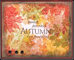
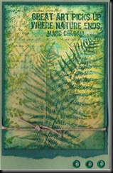
I’m definitely in Autumn mode (it’s quite chilly here, very windy and wet with hail every now and then) so I carried on this theme. Must admit that’s partly cos the gorgeous fern stamp and words were still on my desk, cos I haven’t had chance to tidy it yet, he, he :-) The first one is made with Simple Expressions leafy stamps I used to design and sell when I had Katy’s Corner – seems like such a long time ago now! I still love that leafy stamp set, though, among others!
The second is one I made by overstamping one of my scratch papers. I experimented for a while, using card as my scratch paper to see if I ended up with something usable or interesting and this is one of the pieces I really liked. I just added some fern leaf stamping in a couple of shades of green, edged it in Adirondack Bottle, then layered it onto two shades of green with eyelets and some string. The verse was already stamped on it, so it was a lovely, quick card and I really like it. Looking at it now, I realise I made a mistake when adding the eyelets. They were supposed to go on the left hand side, to balance it, but hey ho – I still like it :-)
Labels: Quick and Easy, Simple Expressions
Sunday 2 October 2011
EUROPEAN TEXT and BLOG CANDY DRAW!
30 very kind comments from lovely people at Sunday, October 02, 2011Daring Cardmakers have a text challenge this week and because languages are dear to my heart, I cheekily ‘borrowed’ the theme for our KCUK Yahoo group monthly challenge, so this is my entry. Artistic Stamper’s Challenge is for Autumn Colours, so I’m entering that one, too, if it’s okay.
I haven’t used these colours for a while but Autumn is the time for gorgeous Autumn colours, even if the sun has been ‘cracking the flags’ in Merseyside and the rest of England most of this week.
The weather is due to change here tomorrow – more rain - and to get cooler as each day passes, due to a cold front coming in, but hey ho – it was lovely while it lasted.
Unfortunately, I had a manic week, teaching lots of classes I’ve never taught before and struggling with very mixed groups, so did nothing but work! Interesting, though :-)
Here’s my card. The French text is in the background, which is how I love to use it.
Colours are Adirondack Butterscotch, Distress inks Aged Mahogany, Wild Honey, Spiced Marmalade and Walnut Ink.
I really LOVE this colour combination.
Labels: STAMPED INKY BACKGROUNDS
Saturday 1 October 2011
More Less is More 35 and another ‘C’ card…
18 very kind comments from lovely people at Saturday, October 01, 2011I really thought that last card looked anaemic, so I went back into my (now very messy) Craft Room for an hour and made a few more cards, amongst which were these two.
I used Versafine ink this time – my favourite for blue and white and it embosses so beautifully. I’m much happier with these and especially, although I hate to say it, with the ‘C’ Card. This is the reason why I bought that lovely Hero Arts set because I knew it would make lovely, quick, simple cards.
Labels: LESS IS MORE, Quick and Easy, THE 'C' WORD
LESS IS MORE WEEK 35 – COLOUR OF YOUR EYES
18 very kind comments from lovely people at Saturday, October 01, 2011Here’s my entry for this week’s Less is More challenge – the colour of your eyes. My eyes are blue, so I used two shades of Colorbox Pigment ink – Sky Blue and True Blue, clear embossed – for my first C card of the year. (Apologies for using this word so early – well it is for me)
I’m very traditional at Christmas and like to remember what it’s all about, hence the stamps I’ve used; Stampendous and Hero Arts.
Labels: LESS IS MORE, Quick and Easy, THE 'C' WORD


