


Monday 27 February 2012
I thought I’d make one but in my new quest to use up all my scraps and half finished bits, I ended up with three cards! All entered in the Gingersnaps Two Colour Challenge.


Sunday 26 February 2012
Not a very apt title because these weren’t made today (Sunday) but I decided it was about time I blogged them because they’ve been made for a few weeks.


I’ve been up in my stamp room for a couple of hours but haven’t really been very productive because I started tidying and sorting through things I really MUST use, including lots of inky background papers and scraps of card! Going back to it now but may just make a card…
Thanks again for all the lovely comments you’ve been leaving – it really does brighten my day so much.
xxx
Friday 24 February 2012
I’ve been a bit annoyed with myself for being so negative over the last few weeks, although being ill didn’t help – nor did the demands of management as we were coming up to yet another Ofsted visit – not a full inspection, just a check on our progress with the new course we’re now delivering, but still highly pressurised. I knew I needed to start focusing on the good things in my life – of which there are MANY, so when I saw that February’s Crusade over at GPP Street Team Crusades was ‘Honour the things we love’, I knew it was perfect for me right now.
So, today I played with layering paints and inks, using lots of bits and bobs and trying out a few new things – including painting my handwriting and stamping without mounts, which I’m NOT too good at!. It’s FAR from perfect – you can clearly see all the mistakes and the little unfinished bits – but it helped me focus on the things I love and treasure; family, friends, nature, birds, music, stars,, words, France, colour and Spring. As I was finishing, I was serenaded by my favourite birdsong – blackbirds – enough to make anyone’s heart sing!


This is a scan of the pages and shows the colours a little more truly. I clear embossed at the end because I’d used some Versafine as well as Stazon, so that affected the way the colours show. I used acrylic paints, acrylic glaze, watercolour crayons, pigment inks, watered down Colorwash, correction fluid and a little distress ink – oh and some charcoal for shading.

I’ve made a few cards over the week – some very simple ones – and I will upload them in the next few days, but hopefully, I’ll get chance to play a bit more by then, all being well. February is birthday month for most of my closest friends and we haven’t yet had chance to celebrate, so it may well be a busy weekend ...
Off to add some journalling now.
xxx
Saturday 18 February 2012
Getting things out of my system…
24 very kind comments from lovely people at Saturday, February 18, 2012Bit of journalling for today. I had intended doing all kinds – stamping wise, that is – but this is all I did in the end.

Page one is about ‘hanging on’.
It’s a mad, mad, world!

This page is a little too busy but once I started writing, I couldn’t stop! I blanked out some of it with a wash of acrylic paint but you can still see bits of it. It’s about respect and trust and how they need to be earned.

Friday 17 February 2012

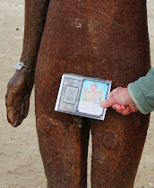
Woman stamp from Stampinback, face from VLV.
If you visit, keep a tight hold on your debit/credit cards…
Inks: Adirondack Pool, Stream and Wild Plum.
Thursday 9 February 2012


Tuesday 7 February 2012
One more monoprint and a couple of others
24 very kind comments from lovely people at Tuesday, February 07, 2012I’m scheduling this because I have a busy week ahead, but I will be checking to make sure it’s okay.
One more monoprint to show you – I hope I get chance to play again with this technique, we’ll see.
This one is made with a solid stamp, using pigment inks, stamping the flowers directly onto the stamp with Versafine ink, then embossing it all.

Difficult though it is to see, I used a sky blue and a pale green on the stamp, edged with True Blue. I’m getting so frustrated with the fact that digital technology doesn’t recognise shade variations – this one’s a photo. Should try with the SLR. The bottom of the stamp is compressed – it must have been stored underneath others at some point, so it doesn’t stamp very well, so I added a piece of ribbon in a similar shade of blue to the edging, then edged the whole card before mounting onto pale blue. Good old Hero Arts Solid stamps.
The next one I’ll enter into a few challenges for this week because it fits
Hels’ ‘Heart on my Sleeve’ challenge
Make My Monday Romance theme and
Try it on Tuesday’s ‘Cards for a True Love’.

I love this stamp. Can’t remember where I got him – could be one of the companies which was going out of business, possibly Scrolls Works? Or maybe Lost Coast or Stamp Camp. I’m in a dribby drabby mood at the moment, as you can see from the background.
I’ve had a bit of a ‘bird fest’ lately, although that’s not unusual for me cos I love birds and have a lot of bird stamps, so this was just another play, using Distress inks.

Thanks for all the lovely comments you’ve been leaving – they really are appreciated. See you soon!
Cath xxx
Sunday 5 February 2012
I did get to play a little with my acrylic blocks but have been struggling to get decent photos. Decided to blog them anyway, despite the fact that the variations in shade and colour are just not showing up – grrr!
No problems with this one because it’s just black and white.


I’ve done more but I’ll save them for another time. I did one on my trusty old large Hero Arts shadow stamp and I quite like that one. Takes me back to when we had the little Stamp Club in the shop. We did quite a lot of mono stamping then – probably around 5 or 6 years ago - and it was so much fun.
Edited: INSTRUCTIONS
Chalk inks also work really well. Haven’t done any samples but that’s what we used years ago, when they first appeared on the market.
It’s not my technique – it’s a standard printing technique which has been used for eons but it’s great for experimenting with. Just wish I had more time to play. Any more questions, please do ask.
For more information on monoprinting the printer’s and artist’s way, see here.
__________________________________________________
The ice has almost melted and the sun is shining, so I may just venture out for a bit of fresh air. No snow here, though. Hope you’re all staying warm x
Saturday 4 February 2012
H’mm, not sure about that, but there’s certainly a rainbow!
This month’s Art Journey Challenge is a Man’s card in Rainbow colours, so here’s my entry.


Friday 3 February 2012
Yay! It’s Friday and my play day!!
Finally finished Kate’s Calendar challenge for Feb. I had it ready last weekend but then tried a full page stamp on it and it was way too patchy, so I decided to redo it today. I added lots of gesso, thicker in some places for some texture, then resprayed it with more Hot Pink ink. It’s turned out okay – looks much better without the circles, lol – but my circles are well tatty. It’s a good job I like a bit of grunge cos they’re full of black and hot pink ink from the wet inks on the page.


Edited: People seem to think my pages are purple – scanners don’t seem to pick up the shades as well as cameras, so I took photos – admittedly in the sun, so a bit washed out – but they’re closer to the real colours, which are hot pink, with some purple. I’m in a drippy, drabby mood, so there are lots of dribs and drabs and splatters of ink on these. I’ll have to draw in the branches missed because of the textured gesso :-)


Thursday 2 February 2012
This is the challenge I sent for KCUK this month – printing with acrylic blocks – otherwise known as mono printing. There are so many possibilities for this technique and I hope to play with them as soon as I’ve finished work for the week, but for now, here are a few simple samples.
For these I just used felt tip pens in two different colours, then spritzed them with water and printed onto white card.