Congrats-Take A Bow!
2 hours ago


Lots of detail on this one - maybe a little too much? It’s a mixture of inks with some resist stamping on glossy card.
Flutterbies is the challenge at Our Creative Corner
Summer Colours is Hels’ theme at Sunday Stampers
and
Words in art is the challenge at 3 Muses.
Some Work in Progress….

Just had a lovely hour playing in my half organised Stamping Room and I can’t find a flipping thing… I think I need to go mad and label things this time, not to mention finish sorting through boxes!
So this is my entry for Artistic Times ‘'Sea of Greens’.
There’s quite a bit of heat embossing, too, so it fits FSC, Challenge 20, which is Embossing.

Back to sorting out after ‘Brunch’.
Hope you’re all enjoying your weekend!
[Edited: the dragonflies are Non Sequitur and the inks are a mixture of Dylusions, Adirondacks, Distress ink and Starburst Stains. The dragonfly words stamp is one of Jo’s wonderful designs for Stampotique]
Forgot to say that one of my cards was chosen as a Spotlight winner on Penny Black and More and went live today, so thank you very much to the team for that!
Thank you for all the lovely comments you’ve been leaving – they really brighten my day!
xxx
I haven’t stamped for almost a week, despite being home, because I’m (shock, horror, gasp…!) reorganising my stamping room but after spending time with one of my really good friends, I ‘snapped’ and just had to make something with one of the backgrounds I was messing with while she was here… in the midst of all the disorder and half painted walls, he, he.
Here’s the result.
Believe it or not, that’s pink and orange, but I put the yellow back without screwing on the lid tightly and mopped up the spillage with the card, so it looks more orangey. The coneflowers are from a SU discontinued set I really wanted (for the grasses – not this one) and it’s a BIG stamp but I love it!
If you enlarge this, you’ll notice (as I did) that she looks as if she has cataracts, lol – I used Prisma pencils to colour and it partly covers the black ink – must be more careful in future :-)
I’m entering this into the Unruly Paper Arts April Reader Art Quest 2, which is sponged backgrounds.
I’m in a flutterby mood and although these started as LIM entries, I decided not to enter them because I’m not over happy with the two qualifying ones – ie the green ones.

Not flutterbies but definitely greens and I went a bit overboard on the edging because it was glossy card and I was using pigment inks.

This one isn’t all green – there’s lots of turquoise/aqua on there, too. I couldn’t scan it because it’s 3D and it looks as if the top wing is a bit curled, lol. The beads aren’t quite as I wanted but I still like it.
I’ve had this book a while and wanted to work through it when I first got it but didn’t have either the time or the desire but yesterday, I was inspired by Willy’s post about 21 Secrets and decided to look for it.
I spent most of the evening working through the first ‘chapter’ of it and here’s what came from it.


Then, this morning, I was up early and started messing around with Prismas. I can'’t begin the next step because it’s too steep for me yet and I need to get used to Step 1, which is being comfortable with making mistakes – a BIG lesson for me!


Wishing you all a Happy and Blessed Easter Sunday!
xxx
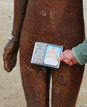
When I saw this stamp, I just couldn’t resist it. It’s very simply coloured, following the guide on the index sheet but I know exactly who it’s for, he, he.
… and thinking things through.
This month’s theme at Art Journal Journey is HANDWRITING. I’ve loved writing in any shape or form since I was a little girl (and defaced every book we had in the house - oops!) I thought I’d have a go. NOT as easy as I thought. I’m never happy with my writing in something like this anyway, but I’m becoming increasingly frustrated with my pens – and I have a few, ahem! I think I need to start working in my A4 journals if I’m to get the effects I want, but for now, these are my A5 efforts.
This is one of my favourite quotations and reads (cos you can’t really read it very clearly) ‘What you do speaks to loudly I can’t hear what you say’.

This one is my ponderings about something which happened at work this week.
And this one’s about a decision I have to make (about work). I really don’t like making decisions!

I used a variety of mediums, starting with inks and chalks, adding bits of ink, water soluble oil pastels and Tombow pens, then finishing off with Prisma Pencils.
I’ve decided I much prefer the correction pens for white highlights, but I find them really difficult to control because you have to squeeze at the same time as writing/doodling and unfortunately that isn’t good for my hands and I tend to lose control because of it. My white gel pens (Signo) only work in a limited way and the Posca is too thick (and uncontrollable) for what I want, despite ordering the thinner one.
I tried some new Pigma black pens but ended up using my Promarker, despite the fact that it’s a little too thick for more than a couple of words and none of them seem to like gel medium or chalks or oil pastels – hence the frustration. If you have any recommendations, I’d be grateful. I’ve tried Sharpies and all sorts of others so far.
Far from perfect but I had fun making these and while I may not have come to any decisions, it’s good to get things down on paper and to start using lettering, although I’ll probably revert to stamps whenever I can.
Hope you’re all having a lovely break!
xxx
My April pages for Kate’s 366 days challenge.

I was going to outline the tags but then decided against it because I love this colour combination and it’s so warm and sunny. Maybe we should do these pages when the month’s complete because March has been such a lovely, sunny month but my pages were dark because I was expecting winds and rain! Let’s hope that April is just as nice, even though my pages are covered in raindrops!
[PS Since I wrote this, the weather forecast for this area on Monday/Tues (2/3 April) is for SNOW! Eeek!!!!!]
Sorry, I haven’t photographed my completed March pages but I did write in them.
Look forward to seeing all your scrummy pages.
Enjoy your Sunday and have a great week!
XXX